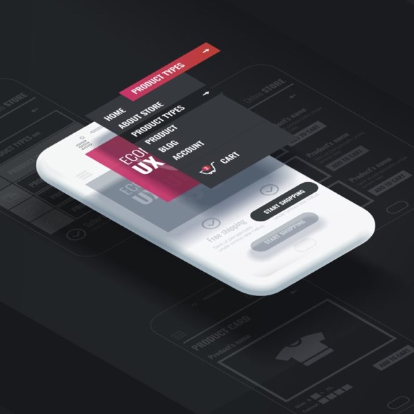
Color schemes are an ever-changing, ever-evolving aspect of mobile app design. There has been a move towards minimal color usage alongside an abundance of white space. This can be implemented perfectly, with a clear two-color palette which provides enough visual separation between linked and active elements, without going overboard with color. It’s minimal but balanced and effective.
Gradients have also changed considerably over the past few years. Where before we used to see fairly muted same-color gradients being used for UI elements, we now see more and more designers implementing high-contrast gradients which use bolder and brighter colors.
Inspiration can come at any time, any place. As a designer I am constantly on the lookout for nice color combinations. Nature and wildlife are a great source for pleasing color schemes. I was flipping through a bird magazine and noticed a cool image of a Falcon. The blue and yellow beak in contrast to the subtle greys and dark feathers gave off an air of confidence and stability. I decided to implement this color scheme in my latest corporate project. The cool, confidence was transmitted seamlessly into the designs conveying a feeling of trust, and assurance.
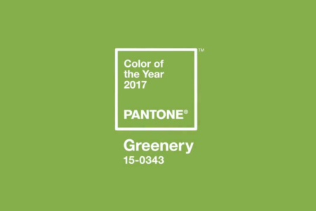
The color green continues to gain popularity with the growing shift toward eco-consciousness. It will show up in everything from fashion to home decor to graphic design. Pantone has crowned the color for 2017 as Greenery – based on its representation of new beginnings, freshness and environmentalism. Other trending colors this year are Dusky blue, Blue-Green, Mineral grey, and Brick.

Try out these trending colors in your next design project! Just keep in mind that different colors evoke different feelings, so let your creativity roll but at the same time use colors that portray the emotions that define your brand.
If you’re looking for inspiration regarding color combinations, you can view some of Pantone’s recommended color pairings on their Color of 2017 page.


